Visual Direction
Brand identity
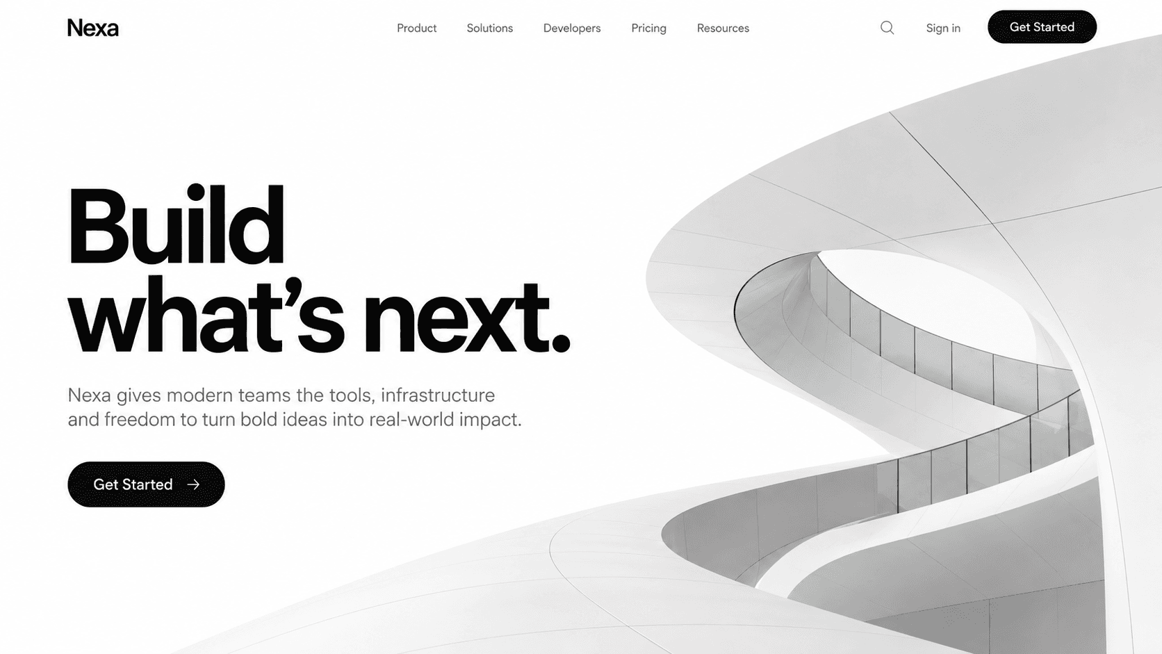
A technology brand concept with confident typography, architectural imagery, and a direct path from message to action.
01 / Overview
A technology brand concept with confident typography, architectural imagery, and a direct path from message to action. This case study explores the visual direction, content hierarchy, and interaction approach shown in the project preview.
Brand identity
Clear routes through the experience
Editorial hierarchy
Designed for different screen sizes
02 / Features
The Nexa concept focuses on three parts of the experience.
Monochrome geometry gives the brand a recognizable visual motif.
A bold headline leads, with supporting copy and actions kept close by.
The product message stays prominent beside the architectural forms.
03 / Workflow
A simple journey through the visual concept, from first impression to the main action.
Understand the central message
Explore the content
Find the relevant details
Reach the next step
Do you want a similar project?